Attention data scientists, text analysts, and researchers! Ready to organize your data into charts and dashboards?
Visual representation of data both enhances your work’s presentation and allows you to examine information from a variety of perspectives. Below is a quick introduction to the business intelligence tool, Tableau, which creates interactive reports, charts, graphs, and dashboards that can be easily shared.
1. Download the Tableau Software
Tableau offers a free one-year subscription for students here and for the public (with limited functionality) here.
2. Connect to Data
Download the two mock sheets of data from here for practice.
On the sidebar, connect to Excel and click on the file you just downloaded, “Global Superstore Orders 2016.xlsx.”
Drag the table marked “Orders” into the “Drag sheets here” pane.
To connect to a second data source, click “Add” and open up “Global Superstore Returns 2016.csv” from the text files.
Click on the JOIN icon to change the data settings to LEFT JOIN.
*Note: Tableau also connects to SQL, Oracle, Redshift, and many other databases.
3. Make a Graph
Click on “Sheet 1” at the bottom lefthand corner of the page, near “Go To Worksheet.”
Drag “Market” to “Columns.” Drag “Sales” to “Rows.”
You will see a simple bar graph with your data!
Drag “Order Date” to “Pages” to see more data influence your graph.
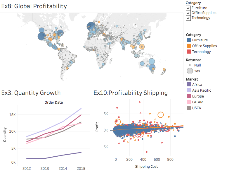
On the righthand side, you can click on pie charts, line graphs, and many others to represent your data in a myriad of ways.
Further Learning:
This information was gathered from D-Lab’s two-hour workshop, “Introduction to Data Visualization with Tableau,” presented by MIMS candidate and data analyst, Deepa Kalpathi.
Look for the next course offering through the Digital Humanities event page, as well as many other software classes.